Wednesday 30 November 2011

A cool mailer idea

This is one of the mailer ideas I decided to make

These are paper cubes that are together to make a large square.
 
 When you hold two oposite corners and pull out the structure begins to change.
 This is the half way point of the structure and it continues to create the square again.

Tuesday 29 November 2011

First spread for the solution

 This is a screen shot of the first page on my solutions after i started to play aroung with different layouts of the title and increasing the use of my boxes.
Because i am going to use a different version of the same girl on each spread I decided to place the correct image in which already I think works better with the colours. I also decided to look at how I could make the page more interesting and edited the block of grey in the background.

Any thoughts would be greatly appreciated :)

Wednesday 23 November 2011

Editorial layout sheets

this is a page where i was experimenting with different layout ideas for my spreads in editorial.

 I took the drawing i had done of a scared girl and worked on editing the eye so that each page would be a little different. This is the page i did.

This is a page where i was looking at what some of my layouts would look like on the computer with the image i wished to use as part of it. I think using the grey on the background worked quite well to link with the style and colour of the image and generally brought the hole design together.

I began thinking of different ideas for the front cover of my book about fear on the streets of Wolverhampton, I played around with different view points of the same girls face.


Some Branding work

Ok so here are some of the layout sheets that I have been working on throughout my first semester...

 On this particular page i was experimenting with differnt fonts, colour techniques and general layouts for my logo for wolverhampton.

 This is another page where i was developing my logo, on this particular page i was using orange as the base colour but on other pages i looked at using a nice range of different shades and tones of colour.

This is the logo that I came up with, there are a few things that im thinking of altering such as the font and the was the colours are darker where the font is and it would be better if this section was lighter.

Tuesday 22 November 2011

Work from my second year at a level

 For my second year we had to select a charity to create some work for and I decided to make one up so that I was free to make decisions without being influenced by existing things. This image is of my mood board from the very start of the project. It includes a number of animal cruelty posters, some images of abused dogs and some pieces i did myself.

 A close up of the corgi from the image above shows that i created it with a collage of coloured images of many other dogs which i thought worked out quite effective.
 
 This image is of a spread from my sketch book on researchin existing dog charities, i used inks to stain the backgrounds of each page to make them link better to the information.

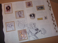
 This is an image of my artist research for the project and i recreated one of the artists pictures on the centre of the page using biro.

 on this picture you can see the design i came up with for my charity and i am experimenting with different colours and fonts.

 Again this is some of my sketchbook work where i was developing some ideas for my letter head.

 This is another artists page where i have focused on Christopher Gibbons style of illustrating dogs and applied it to some of my own drawings.

This is an image of a dog that I created using hama beads similar to the style of Ian Wright who i looked at on my artist research page

Some of my work from my first year of a level

Ok so while I was tidying my room i come across all my old work from sixth form so I thought I'd share some of it with you guys.. this was for a childrens alphabet book, as part of my research i looked at what animals could be used. I got the pictures, made each letter with them and drew out the rest of the image.

 Another project i was given in year 12 was to create a restaurant brand which included a logo, letter head, menu and business card. Each of us were given a different country so we had to work individually and mine was Africa. On this particular page i did a collage of different aspects that relate to africa.

For the same project as the one above this is the final outcome I produced.

Thursday 3 November 2011

Editorial First Set of Three

This is my first double page spread for the section of the book about the problem, although you've seen i before ive added a bit of colour to make it a little more interesting. Ive chosen red because people associate red with danger and i felt it would relate well to my topic.

This is the second spread and this time ive moved the girls face to the other side of the page. Again i have used red to make them look like a set. Also i have slightly lightened the background to the spread which i plan to do throughout all the designs.

Ok, although you cant really see where the text is on this design, there are four colums on the right hand page and im thinking of having some bullet points on the left hand page next to the face. Im not too sure about the possitioning of the word intimidation though, so let me know what you think :)

Wednesday 2 November 2011

Interactive Flash Site

http://www.26000vodka.com/
Ok so as part of out new brief in New Media we are required to make a microsite or online toy. So to gather some ideas and to get a feel for whats already out there I've been searching around to find some examples that i like. This particular site i found was really interesting, i like how the navigation works and how everything sort of twists when you move the curser around. Let me know what you think :)

Tuesday 1 November 2011

Animated Logo

Ok although it doesnt say at then end frame for very long you get the idea. This is my animated logo for New Media and the idea behind it was to illustrate the varieties of people that come together within the comunity of wolverhampton to make it what it is today. I was stuck on the music behind it for quite a long time and decided to go down the path of using happy and cheerful piano chords which i think worked quite well. Hope you like it :)

Typography sketches

 Here I have completed an A3 layout sheet with hand rendered examples of fonts that I have found that relate to the fear and emotions people can feel on the streets. My new brief for New Media is to create a microsite or online toy that associates to my topic in Editorial Design so this sheet relates to both of them.